Interactive Financial Visualizations: Making Sense of Market Trends


The Power of Interactive Financial Visualizations
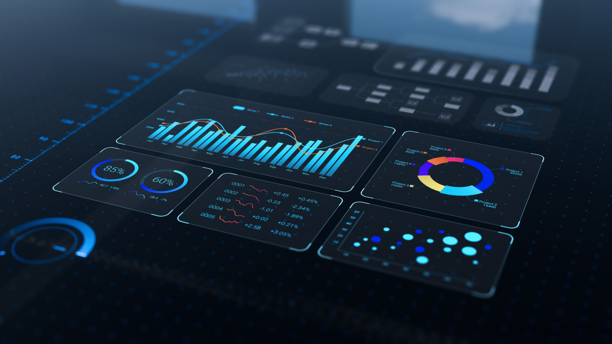
In the fast-paced world of finance, understanding market trends is crucial for making informed decisions. With the increasing complexity of data, traditional methods of analysis are often inadequate. This is where interactive financial visualizations come into play, offering a dynamic way to interpret complex datasets.
Interactive visualizations transform static numbers into engaging, meaningful visuals. These tools allow users to explore data in a hands-on manner, making it easier to spot trends and correlations. By presenting data visually, users can quickly grasp insights that might be difficult to discern from spreadsheets or reports.

Benefits of Interactive Visualizations
The benefits of utilizing interactive financial visualizations are numerous. Firstly, they enhance the ability to identify and understand market trends. Visualizations can highlight patterns and anomalies, providing a clearer picture of market dynamics. This leads to more accurate forecasting and better strategic planning.
Additionally, these tools promote more effective communication within organizations. When financial data is presented visually, stakeholders at all levels can understand it without needing a deep financial background. This democratization of data fosters collaborative decision-making and drives business growth.
Key Features of Effective Visualizations
Effective financial visualizations share several key features that make them indispensable. They are typically interactive, allowing users to manipulate and drill down into the data for deeper insights. This interactivity enables users to focus on areas of interest and customize their analysis.
Moreover, these visualizations often incorporate real-time data, which is crucial for staying updated with the latest market developments. By integrating live data feeds, users can react swiftly to changes, ensuring their strategies remain relevant and effective.
Tools and Technologies
A variety of tools and technologies are available to create interactive financial visualizations. Popular platforms like Tableau, Power BI, and D3.js offer robust functionalities for building custom visualizations tailored to specific needs. These tools provide a range of options for data representation, from bar charts and line graphs to complex heat maps and network diagrams.
The choice of tool often depends on the complexity of the data and the specific requirements of the user. Each platform offers unique features that cater to different aspects of financial analysis, ensuring that businesses can find the right fit for their needs.
Implementing Visualizations in Your Strategy
Integrating interactive visualizations into your financial strategy involves a few key steps. Start by identifying the most critical data points that align with your business objectives. Next, choose the appropriate visualization tool that best represents this data in a clear and engaging manner.
- Define your objectives and key metrics.
- Select a suitable visualization tool.
- Create prototypes and gather feedback.
- Implement changes based on insights gained.
By following these steps, organizations can harness the full potential of interactive visualizations to drive strategic decisions and achieve their financial goals.

The Future of Financial Analysis
As technology continues to evolve, so too will the capabilities of financial visualizations. Emerging technologies like artificial intelligence and machine learning are set to revolutionize how we analyze market trends. These advancements will enable even more sophisticated visualizations that can predict future trends with greater accuracy.
In conclusion, interactive financial visualizations are invaluable tools in today's data-driven world. By making complex data accessible and actionable, they empower businesses to make informed decisions and stay ahead in competitive markets.